
Comeval’s corporate identity has changed in 2024: alongside the ARI Armaturen rebrand, the Comeval logo has changed its look in line with the group.
There are several strong reasons behind this logo change that made the update a necessary step.
IMPROVING THE ARI IDENTITY
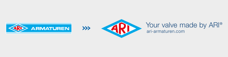
The new ARI logo design drops the word Armaturen to avoid it being read as the company’s only name while overlooking the word ARI inside the diamond. Now, leaving just the symbol and improving the legibility of the lettering, brand recognition is stronger.
ADAPTING TO THE ARI CHANGE
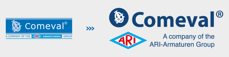
Until this year the Comeval logo had elements similar to the ARI logo, such as the box behind the lettering and the lines around its edges. These elements no longer made sense with the new change, so we chose to give the word Comeval greater presence with strong typography and a striking new colour. These changes are intended to project a strong, visible and legible identity, reducing the number of elements so it can adapt to any context.
Just like the Comeval logo, our own brands will also see a change in their look, giving them more personality and setting them apart from one another to highlight the specialisation of each of our areas of work.